
Last year, we surveyed more than 1,200 event participants about our registration pages. Participants were clear with what slowed them down: too much scrolling, a hard time finding information, and not mobile friendly enough.
That’s the problem we set out to solve, building a registration page designed to be the best in the industry.
This first set of updates tackles the navigation, hero section, the Event Overview, and a new Message Center. Four areas, one goal. Help participants find what they need fast, and without friction.
Fewer clicks, faster registration
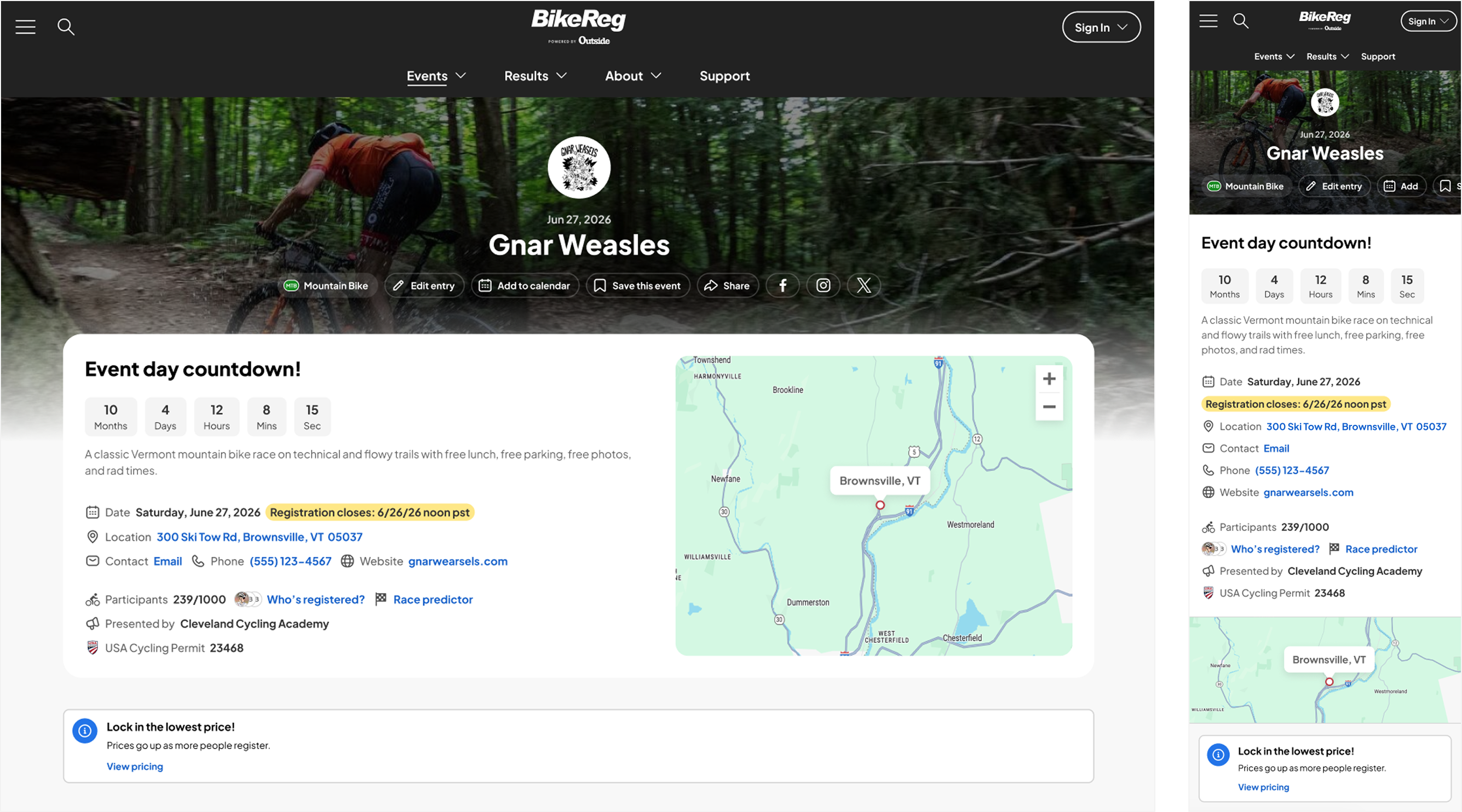
Getting around the page used to take more work than it should. We rebuilt the navigation using real usage data on what participants look for and click on most, so “Events” now sits front and center across menus and filters.
Search results got more useful too. They now show title, date, and location at a glance instead of a bare list.
On mobile, where the difference matters most, we cut three separate menus down to one, a 67% reduction in navigation complexity. Fewer decisions between “I’m interested” and “I’m registered” means fewer people dropping off along the way.
The result is a more consistent, more predictable page. Once someone learns how to move around one event page, that same logic carries over to every other event on athleteReg.
Everything at a glance
Your event name, date, and logo lead the page with a cleaner hierarchy, along with a new event type label. You can customize your logo as a rectangle or circle, whatever fits your brand best. Sharing tools are right there too, including a new Instagram link, so participants can easily spread the word.
Everything your participants need, without the scroll
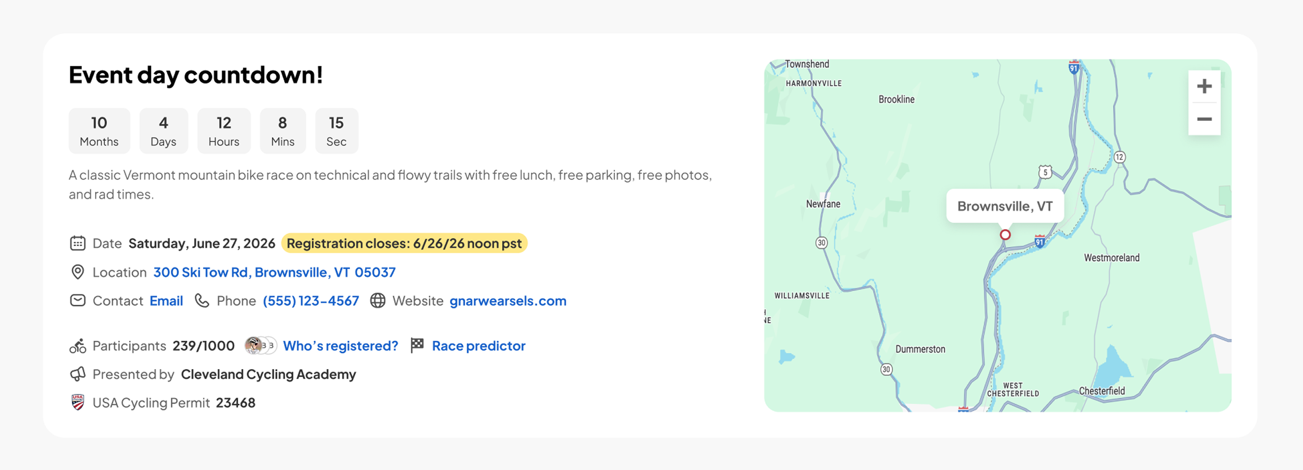
We consolidated contact info, location, and event details into the new Event Overview section. No more scrolling back up to find something you already scrolled past. Everything participants need is right there, easy to locate at a glance, up to 31% less scrolling to reach your contact info.
You’ll also have access to a short description field, along with a live participant count and an optional countdown timer as those features roll out, easy wins for building urgency and showing momentum without any extra work on your end.
Updates participants actually see
Alerts, confirmations, and pricing changes now live in one consistent message center instead of being scattered across the page. Standardized message types mean participants always know what they’re looking at, and important alerts show up as clear, simple pop-ups.

What this means for your event
A clearer path in means fewer registration drop-offs and fewer support headaches, without you having to do anything differently. The design does the work.
Get ready for the new registration page by prepping a few things now: your Instagram handle, Facebook handle, and event description. That way, everything’s in place to update the moment it’s live, and your page is ready to help participants find what they need from day one.
New to athleteReg? Request more information about setting up your event registration page.